
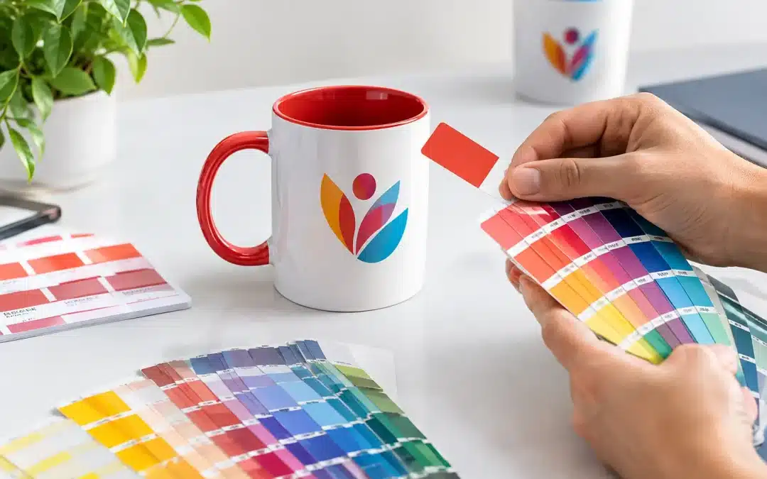
A brand colour that looks right on a screen can print very differently on a clear beer glass, a frosted wine taster or a coloured plastic cup. Knowing how to match pantone print colours gives you a far better chance of receiving drinkware that feels true to your brand, campaign or event theme – without surprises once production is underway.
For custom plastic glasses, Pantone matching is about more than selecting a number from a chart. The artwork, printing method, glass colour, ink coverage and finish all influence the final result. A little preparation at the artwork stage helps create a cleaner, more consistent outcome across every glass in your order.
Start with the correct Pantone reference
Pantone is a standardised colour system used to communicate specific ink colours between designers, printers and suppliers. Rather than describing a logo as “dark blue” or “bright red”, you can nominate a recognised Pantone reference, such as Pantone 286 C. This removes guesswork and gives the production team a clear colour target.
The letter after the number matters. “C” refers to coated stock, while “U” refers to uncoated stock. These guides were developed for paper, so they are not a perfect prediction of ink printed onto plastic. Even so, they remain the most useful common reference for branded drinkware.
If your organisation has brand guidelines, check whether they specify Pantone Solid Coated, Pantone Solid Uncoated, CMYK, RGB or hexadecimal values. For a single-colour logo printed on plastic glasses, the Pantone spot colour is usually the key detail to provide. If you only have RGB or web colour values, your supplier can help identify the nearest practical Pantone equivalent, although a direct conversion is not always exact.
Choose spot colour printing when colour consistency matters
Most logos on personalised plastic glasses are produced with spot colour printing. A spot colour uses a pre-mixed ink formulated to match a nominated Pantone shade as closely as the material and print process allow. It is an effective choice for bold logos, text, icons and simple artwork where a crisp, identifiable brand colour is the priority.
Process printing, often described as CMYK, creates colour by layering cyan, magenta, yellow and black inks. It is useful for photographs, gradients and detailed full-colour artwork, but can be less predictable for a specific corporate colour. Some vivid blues, oranges, greens and fluorescent shades sit outside the standard CMYK range and may lose their impact when reproduced this way.
For many event and promotional orders, a one- or two-colour spot print delivers the strongest value and the clearest result. It also makes a logo easier to read from across a bar, on a festival table or in a busy function space. If your artwork includes a photographic design as well as a strict brand colour requirement, ask whether a combination of print methods is suitable for the selected glass.
Understand what the plastic glass changes
A Pantone chip is viewed on paper. Your logo may be printed onto clear, white, black, coloured, frosted or translucent plastic, and each surface changes the way the eye sees the ink.
A white plastic cup provides the most neutral base and usually offers the closest visual starting point for colour matching. Clear and frosted drinkware can make ink appear lighter or more translucent, especially when light passes through the glass. A dark-coloured glass may require a white underbase beneath the printed colour so the logo remains visible. Without it, a yellow, red or blue print can look muted against the background.
This is not a fault in the Pantone reference. It is a practical consequence of printing ink onto a non-paper surface. The same Pantone colour can look slightly different on a white mug, a clear beer glass and a black reusable cup. Where colour accuracy is critical, nominate the product colour early so the production approach can be planned correctly.
Opacity, finish and viewing conditions
Ink opacity is another consideration. A highly opaque ink gives stronger coverage, while a more transparent ink may create a lighter effect. Some designs deliberately use transparency for a subtle, contemporary look, but it is not generally the best choice for a logo that needs to stand out.
Finish also influences perception. Glossy plastics reflect more light, while matte or frosted surfaces soften the appearance of printed colour. Lighting makes a difference too. A glass viewed in daylight may look different under warm venue lighting or cool LED lighting. For most promotional drinkware, the goal is a close, consistent brand representation rather than a laboratory-perfect match in every environment.
Prepare artwork for accurate Pantone print colours
Good colour matching begins with production-ready artwork. Vector files are preferred because they preserve sharp edges and allow colours to be identified cleanly. AI, EPS and editable PDF files are commonly the best formats for logos and line art. High-resolution files may work for some designs, but low-quality screenshots, compressed images and images copied from social media often produce rough edges or unclear colour information.
Supply your artwork with the Pantone reference clearly stated. If a logo includes several colours, identify each one. It also helps to advise which colour is most important if a close match is required for one element, such as the main logo mark rather than a small supporting graphic.
Avoid relying on the colour shown on your monitor. Screens use emitted light, and monitor settings vary widely between devices. A bright blue on a mobile screen can appear darker or more violet in print. Printed Pantone guides are more reliable for colour selection, but the final substrate still needs to be considered.
If your designer has supplied artwork in CMYK, do not simply assume the nearest Pantone will match perfectly. Ask for the original brand Pantone specification where possible. If there is no existing Pantone reference, select the closest shade from a physical Pantone guide and communicate that choice before the digital proof is prepared.
Use the digital proof as a production check
A free digital proof is an essential part of a custom drinkware order. It confirms the logo position, print size, orientation, product selection and nominated colours before production begins. It is the time to check that the design is centred, the text is readable and the artwork uses the correct Pantone references.
A digital proof cannot fully replicate printed ink on plastic, because it is viewed on a screen. Treat it as a layout and approval tool rather than an exact physical colour sample. If your order is for a major campaign, a national event, a hospitality rollout or merchandise that must meet strict brand requirements, discuss whether a physical pre-production sample is appropriate. This can add time and cost, but it may be worthwhile where colour approval carries real commercial weight.
Review the proof carefully before approving it. Check the spelling of all text, confirm the quantity and glass style, and ensure any white underbase has been included where needed. Once printing has commenced, changes are difficult and can affect delivery timing.
Plan for the details that affect consistency
For repeat orders, keep a record of the approved Pantone colour, product style, print position, artwork version and any underbase instructions. This makes future reorders much easier and helps maintain a consistent look across different events or locations.
It is also worth considering whether the same artwork will appear on other promotional products. A Pantone colour can be reproduced differently on fabric, paper, metal and plastic. Using one Pantone reference across all items is still the right starting point, but allow for natural variation between materials and production methods.
At PlasticGlasses.net.au, the most reliable outcomes come from an early conversation about the logo, glass style and intended use. A club ordering reusable schooners, a business planning an activation and a couple organising wedding favours may all use the same colour-matching principles, but their priorities can be quite different.
The best result is not simply a Pantone number on an artwork file. It is a colour choice matched to the right plastic glass, print method and approval process, so every guest leaves with a useful branded item they will want to keep using.