
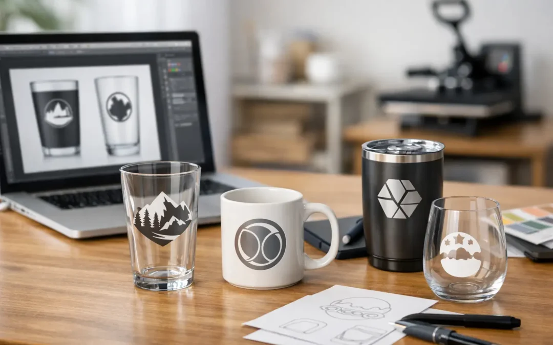
A logo that looks perfect on a screen can lose its impact quickly when it is printed too small, supplied in the wrong format or designed without the glass shape in mind. Knowing how to prepare drinkware artwork files helps avoid production delays and gives your branded cups, beer glasses, wine tasters or event mugs the clear, professional finish they are meant to have.
Custom drinkware is a highly visible promotional product. Guests hold it, photograph it and often take it home after the event. Whether you are ordering for a corporate activation, brewery, sporting club, wedding or milestone birthday, a production-ready artwork file makes the approval process faster and protects the detail that makes your design recognisable.
Start with the drinkware and print method
Artwork should not be created in isolation. A wide beer glass, a narrow flute and a mason jar each provide a different printable area, while a design that wraps around a cup needs a different approach to a centred front print.
Before finalising your file, confirm the selected drinkware style, print position and decoration method. Standard printed branding is an excellent option for bold logos, event names and coloured campaign artwork. Laser etching produces a refined, permanent mark, but it does not reproduce full-colour graphics. The final appearance depends on the material beneath the etched area, so a simple, high-contrast design generally works best.
It also matters whether the artwork is intended for one side, both sides or a full wrap. A one-sided logo can be larger and easier to read from a distance. A wrap design offers more visual impact, but fine text or a detailed pattern may become difficult to follow as it curves around the drinkware.
Use vector artwork wherever possible
The strongest files for custom drinkware are vector files, usually supplied as AI, EPS or PDF. Vector artwork is built from editable paths rather than fixed pixels, so it can be resized without becoming blurry. This is particularly valuable for logos, line art, text and icons.
A high-resolution PDF may be suitable when it contains vector elements, but not every PDF is the same. If a logo was originally saved as a low-resolution image and placed into a PDF, it will still print like a low-resolution image. A quick test is to zoom in closely: clean vector edges remain sharp, while pixel-based artwork becomes blocky or soft.
JPEG, PNG and other raster formats can work for photographic or highly detailed images, provided they are supplied at the final print size and at a suitable resolution. As a practical guide, aim for 300 dpi at actual size. Do not enlarge a small web logo and expect it to become print-ready. Upscaling can make it physically bigger, but it cannot restore missing detail.
Keep logos in their original form
If you have access to your organisation’s original logo files, supply those rather than downloading an image from a website or social media profile. Web images are usually compressed and sized for screens, not production. The original brand file also makes it easier to match colours and retain fine elements such as trademark symbols, borders and small type.
Set colours for print, not just screens
Screen colours are created with RGB light, while printed designs use ink. This is why an electric blue seen on a mobile or monitor may look different once printed onto a plastic glass. For branded campaigns, clubs and businesses with established identity guidelines, Pantone references are the most reliable way to communicate the intended colour.
Include Pantone spot colour codes where they are available, especially for logos that need to match existing signage, uniforms, packaging or merchandise. A supplied brand guide is useful for this purpose. If Pantone values are unavailable, provide the closest CMYK values and a clear reference file, but allow for a degree of variation between screen previews and physical print.
Avoid relying on an RGB screenshot as your only colour instruction. It is fine as a visual reference, yet it should not replace a defined print colour. White artwork also needs to be clearly identified. On clear, frosted or coloured drinkware, white ink can be an essential part of the design rather than an empty space in the file.
Make text easy to read at drinkware size
Drinkware has a compact print area. What looks comfortably legible across an A4 page may be too small once it is placed on a tumbler or flute. Event dates, website addresses and sponsor lines need particular care, as they are often the first details to become unclear.
Use a clean typeface with enough weight for the intended print size. Very thin strokes, fine script fonts and tightly packed lettering can fill in or lose definition during production. If the design includes reversed-out text, such as white letters inside a coloured shape, leave enough space around the letters so the background colour does not crowd them.
Convert all final text to outlines before sending a vector file. This changes the font into editable shapes and prevents unexpected substitutions if the production team does not have the same font installed. Keep an editable version for your own records as well, because outlined text is no longer easy to revise.
Simplify details that will not survive production
A detailed crest may look excellent on a computer but need refinement for a small print area. Reduce extremely fine lines, tiny dots and closely spaced elements where possible. Simplification is not a compromise in quality. It is often the step that makes a logo more readable, more durable in appearance and more effective from across a table or bar.
For laser-etched drinkware, focus on clear shapes and defined contrast. Large filled areas, crisp line work and uncomplicated lettering generally provide a stronger result than tonal shading or photographic effects.
Build the file to the supplied artwork template
An artwork template shows the maximum printable area and guides where your design can be positioned safely. It is not simply an outline to fill from edge to edge. Curved vessels can distort the perceived size and alignment of artwork, particularly near the edges of a wrap.
Keep important elements inside the safe area. This includes logos, names, phone numbers, dates and key visual features. Background patterns may extend further where appropriate, but they should be planned with the shape of the drinkware in mind. Do not assume a design created for a flat flyer will transfer directly to a curved cup.
If you would like branding on both sides, indicate which artwork belongs on the front and back. Where two designs need to line up, such as a logo on one side and a slogan on the other, make that instruction clear in the file name or accompanying notes.
Name files clearly and include useful instructions
A well-named file saves time when several designs, cup styles or print colours are involved. Use a simple format such as `Organisation_Event_CupStyle_Front_PrintColour.pdf`. Avoid vague names like `final-final-new.pdf`, especially when more than one person is approving the order.
Along with the artwork, provide the essential production details: the drinkware product, required quantity, print locations, number of colours and any Pantone references. If you have a specific deadline for an event, mention it when requesting a quote. This allows production timing and artwork requirements to be considered from the beginning.
For larger campaigns, it can help to include a visual mock-up showing how the design should sit on the cup. This is especially useful when logos, sponsor marks and event details must appear in a particular order.
Review the digital proof carefully
A free digital proof is your opportunity to check the production layout before printing begins. Review it as if you were a guest holding the finished glass. Is the logo facing the correct way? Is the event date correct? Does the print look balanced in the available area? Are all colours, spelling and contact details accurate?
Do not approve a proof based only on the overall impression. Read every word, check the quantity-related details and compare the design against your supplied artwork. Changes are usually simpler before production than after a full event order has been completed.
PlasticGlasses.net.au can assist with practical artwork guidance and digital proofs, particularly where a supplied design needs adjusting to suit the chosen drinkware. That support is most effective when the initial file is clear and the intended outcome has been explained.
Give your artwork enough time
The best custom drinkware projects allow time for artwork review, proof approval and any necessary refinements. This does not mean every order needs a long design process. A clean vector logo and a clear brief can move efficiently. More complex work, such as multi-colour designs, wrap artwork or brand colour matching, may need a little more checking.
Send the best available logo, define the colours and keep the design clear enough to work at cup size. With those foundations in place, your drinkware can do what it was ordered to do: serve the occasion well while keeping your brand, message or celebration in guests’ hands long after the last drink.