
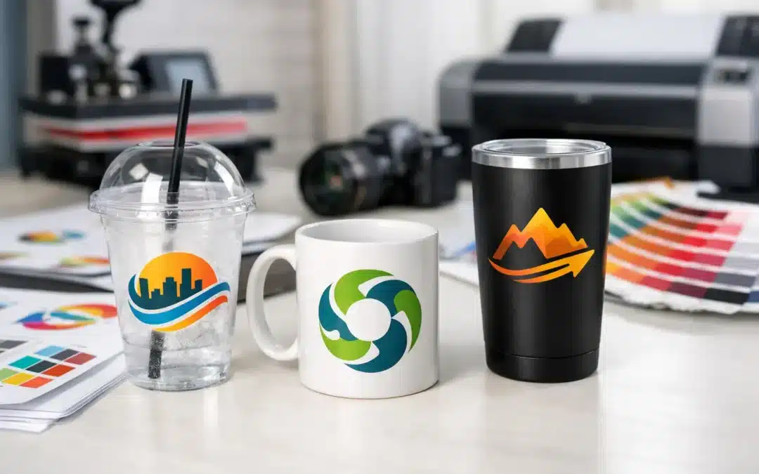
A logo that looks sharp on a computer screen can lose fine detail, change colour or appear soft once it is printed on a curved cup. That is why the question of what artwork format for cup printing deserves attention before production begins. The right file helps deliver clean, consistent branding on custom plastic glasses, whether you are ordering for a corporate promotion, club event, wedding, venue or product launch.
For most cup printing projects, a vector artwork file is the preferred starting point. It gives the printer the best chance of reproducing your design accurately at the required size and in the correct colours. However, the best option can depend on the decoration method, the detail in your artwork and the drinkware style you choose.
What artwork format for cup printing is best?
Vector artwork is generally the best format for cup printing. Common vector file types include AI, EPS and editable PDF files. Unlike a standard image file, vector artwork is built from mathematical lines and shapes rather than a fixed grid of pixels. This means it can be enlarged or reduced without becoming blurry.
For logos, text, line art and single-colour graphics, a clean AI, EPS or vector PDF file provides the clearest path to a professional result. It also makes it easier to separate spot colours, match Pantone references and prepare the design for screen printing or other production methods.
A high-resolution PDF can also be suitable when the artwork has been correctly supplied and fonts are embedded or converted to outlines. If you are unsure whether your PDF is truly vector-based, the file may still be useful for a free digital proof. An experienced artwork team can check its suitability and advise on the next step.
Raster images such as JPEG, PNG and TIFF files can sometimes be printed, particularly where full-colour images or photographs are required. The key consideration is resolution. A low-resolution image taken from a website, social media page or mobile screenshot will usually not reproduce cleanly on drinkware.
Why vector files produce better branded cups
Custom cups are practical eventware, but they are also highly visible brand assets. Guests hold them, photograph them and carry them through a venue. Soft edges, unreadable text and incorrect colours can weaken the impression you worked hard to create.
Vector files keep logos crisp because the artwork can be scaled to suit a beer glass, reusable stadium cup, wine taster, flute, stein or mason jar without sacrificing quality. They are particularly valuable when your design includes small lettering, fine borders, icon details or precise spacing.
They also support better colour control. If your organisation has established brand colours, provide the relevant Pantone colour references where available. Pantone matching is far more reliable than asking a printer to judge a colour from a screen, as screen settings, lighting and file exports can vary considerably.
There is a practical exception. A photographic design, detailed illustration or multi-colour image is usually not available as a vector file in the same way a logo is. In these cases, a high-resolution TIFF, PNG or print-ready PDF may be the appropriate option. The file should be supplied at the intended print size and at least 300 dpi wherever possible.
Avoid artwork copied from the web
A logo downloaded from a website is often too small for print production, even if it appears clear online. Website graphics are designed for fast loading and screen display, not for printing on a physical product. The same applies to screenshots, compressed files received through messaging apps and images pulled from social platforms.
If a JPEG is the only artwork you have, send it through rather than abandoning the project. It may be usable for a simple, larger design, or it can help identify the correct logo version. Your original designer, marketing team or franchise head office may also be able to provide the vector master file.
Match the file to the printing method
The ideal artwork format for cup printing also depends on how the decoration will be applied. Different methods suit different designs, quantities and product materials.
Screen printing is a popular choice for bold logos, simple graphics and spot-colour branding. It performs particularly well when artwork has clear solid areas, defined lines and a limited number of colours. Vector files are strongly preferred because each colour can be prepared accurately for printing.
Digital printing can suit more detailed, full-colour artwork, including gradients and photographic elements where the selected cup and production process allow it. A high-resolution raster file may be appropriate, although a print-ready PDF or vector elements remain helpful for sharp text and logos.
Laser etching creates a refined, permanent-looking mark by removing or changing the surface layer of compatible drinkware. It does not reproduce full-colour artwork, so the best designs are usually single-colour line art, text or logos with enough space between details. A vector file gives the most dependable result here too.
Artwork does not need to be overly complicated to make an impact. On a curved cup, a strong logo, event date, campaign message or simple commemorative graphic often reads better than a crowded design. The product itself is part of the presentation, so leave the artwork room to breathe.
Set up artwork for the shape of the cup
Cup printing is not the same as printing a flat flyer or business card. A drinking vessel has curves, tapering and printable areas that vary between products. Artwork near the top or bottom of the print area may appear different in proportion once the cup is viewed from an angle.
This is where a digital proof is valuable. It shows how your design is likely to sit on the selected drinkware before production proceeds. Review the proof carefully for logo size, placement, spelling, event dates, phone numbers and colour references. A proof is also the right time to decide whether a one-sided print, wraparound design or two-sided layout will best suit the purpose.
Keep important wording away from the edges of the artwork area. Fine text close to a curve, handle, mould line or narrow section of the cup can become harder to read. Similarly, very thin lines and tiny reversed-out details may not hold as well as a simplified version of the logo.
For a busy event, visibility matters at a glance. A large central logo may be more effective than multiple small messages. For weddings and milestone celebrations, names and dates should be checked with particular care, as the printed glass often becomes a keepsake long after the occasion.
Convert fonts to outlines where possible
If you are supplying an AI, EPS or editable PDF, convert fonts to outlines before sending the final file where possible. This changes the lettering into shapes, preventing font substitution if the printer does not have the same typeface installed.
If outlining fonts is not an option, include the font files only when you have the correct licence to share them, or supply a high-quality PDF for review. Do not rely on a text box in an editable file remaining exactly as it appears on your device.
Artwork details that can affect your result
Before approving your cup artwork, consider a few production realities. These small checks can save time and help keep your branding consistent across every glass.
- Use solid, high-contrast colours where possible, especially for event messaging that needs to be read quickly.
- Supply Pantone references for branded spot colours instead of relying solely on RGB or screen colours.
- Make fine lines thicker and small text larger if the design will be printed in a compact area.
- Remove backgrounds that are not needed, particularly from PNG or JPEG logos.
- Check that your artwork does not include copyright-protected images, licensed logos or brand elements you do not have permission to reproduce.
Transparent backgrounds are useful for digital artwork, but they do not automatically solve every print requirement. The colour of the cup can influence how printed inks appear. White ink on a clear or dark plastic cup, for example, may need a different approach from dark ink printed on a frosted cup. Your final proof should reflect the chosen product and decoration method, not just the design on a plain white page.
What to send with your artwork file
The artwork file is the starting point, but a few supporting details help a supplier prepare an accurate proof and quote. Include the drinkware style and quantity, the number of print colours, the preferred print position, your Pantone colours if applicable, and the date you need the order delivered.
It is also useful to explain how the cups will be used. A branded beer glass for a brewery activation may need bold, high-impact artwork. A community club fundraising cup may need sponsor logos arranged clearly. A wedding design may prioritise names, dates and a refined finish. Context allows the artwork team to recommend a practical layout rather than simply placing a file on a template.
At PlasticGlasses.net.au, customers can submit the best artwork they have available and receive a digital proof before production. That consultative step is particularly useful when a logo needs simplifying, a file needs converting or a design must be adapted for a specific cup shape.
A good print result begins with a good file, but it is completed through careful proofing and clear communication. Send the highest-quality artwork available early, confirm the details that matter to your brand, and allow the design to be tailored to the drinkware. Your guests may only hold the cup for a few hours, but a clear, well-produced print can keep your name in their hands and mind long after the event.